DrMoab
NAXJA Forum User
- Location
- The Utah Backwater
when you get them done let me know...I also would like to buy a few to put in my moms basement....as John John likes to call it.
I told my 9 year old that kids only mess with her because she hates it.MMIXJ said:well at least you're living up to your promise...
i can only speak for myself, but i've never popped in on any of the other chapter forum--
but for some reason the CO forum is sure popular for all you folks in the other 49 states
who aren't fortunate enough to live here.
no worries though, you can be our (honorary) "village idiot" too! :dunce:
terry
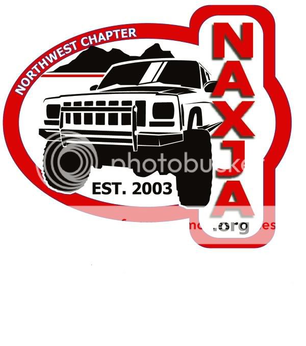
XJourney said:Not sure if any of you care about this but I thought I would bring some inspiration. This is what the Northwest Chapter came up with for our Decal.
Nice, simple, and clean. Hope that helps.
Hans
Agreed! Nice and clean.jrsxj98 said:Hey thats a nice looking logo........
BillR said:Agreed! Nice and clean.
Point taken. :laugh3:bgcntry72 said:But its a Jeep.
Nice and Clean does not fit, IMHO.
Carry on.
I believe it will be discussed this weekend at the chapter meeting.Sandman XJ said:What is the status of our logo? I would like to sport one while out at EJS
Sandman XJ said:What is the status of our logo? I would like to sport one while out at EJS
YELLAHEEP said:Now, as far as the Northwest chapter's logo, it is a great looking design. But, there's no way we're gonna copy theirs and swap the Colorado Chapter into it. Each Chapter should be represented by an individual and unique logo.

 ig:
ig:JohnJohn said:Just giving feedback here:
I think the wheels need to be changed. The front axle and wheels look very "tinker toy'ish" I would rather see a less extreme XJ in the same spot. I also think the sticker needs to have a full black outline. The design factor of the 1/2 moon things are nice but not practical for a round sticker.